Floral Calm
- 18 interviews and 15 usability tests
- 100% onboarding completion
- Gamified mood tracking and Mindful Quest

Instant coffee? Fine. Instant UX? Never.
MSc in Human-Computer Interaction, University of Nottingham. Two years designing B2B, EdTech and D2C products for brands including Amazon, HDFC and Man Matters. Every project here shows the decisions behind the screens, and why.
Let's say:
That's about how long the whole menu takes: five projects, with the real screens and research behind each one.
Pick your brewEvery cup's brewed differently: shipped work, research and VR.
The results I'm proudest of. Each glass holds the before; tap it to pour the after.
BeforeComplex flows slowed users down.
BeforePartner schools needed learning screens students would keep using.
BeforeYoung adults drop apps that feel generic.
BeforeHousehold fitness trackers live on separate phones.
I'm based in Nottingham and open to UI/UX and product design roles.

A UI/UX designer who asks why before opening Figma. I like research that changes the design, not research that decorates it.
Magazine covers, posters, illustrations and sketches from my design side quests.
The real screens, research and results behind every card. Jump to a project, or read them in order.
Gamified mental-health app for 21 to 26-year-olds: 100% onboarding completion across 15 usability tests.
Results from 15 usability tests.
BecauseInterviews showed young adults drop mental health apps that feel generic.
SoAn onboarding questionnaire shapes the app. 100% completed onboarding.
BecauseRetention was the core problem, not features.
SoMindful Quest turns small steps into a journey. 92% tracked their mood successfully.
BecauseGoal setting scored lowest, at 75%.
SoIn the Deliver phase I reworked goal customisation and reminders instead of polishing screens that already worked.
| Task | CompletedDone | Avg time | Errors | Rating |
|---|---|---|---|---|
| Onboarding | 100% | 3.5 min | 0 | 4.8/5 |
| Mood tracking | 92% | 2.5 min | 1 | 4.7/5 |
| Relaxation exercise | 100% | 5.0 min | 0 | 4.5/5 |
| Community forum | 83% | 6.0 min | 2 | 4.2/5 |
| Customising goals | 75% | 5.5 min | 3 | 4.0/5 |
Highlighted: the two weakest flows, which shaped what to fix next.
It made me feel at ease.On onboarding
It's fun and quick to track my mood this way.On mood tracking
Maybe adding a quick tutorial or a prompt when I first enter the forum could help.On the community forum
I didn't know if I had saved my goals or not; the feedback wasn't clear.On goal setting
Strongest: clear status messages, consistent calming visuals and an uncluttered layout. Weakest: goal setting and the forum, where people needed more guidance.
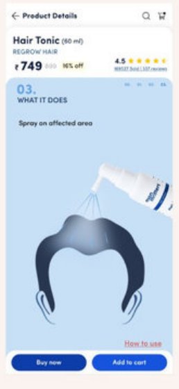
Shipped a product-page redesign that improved add-to-cart conversion for a D2C wellness brand.
Starting point from the funnel analysis. The live redesign improved add-to-cart conversion; the files give no figure for the uplift.
BecauseThe page was 8,675px, nearly twice the four competitors I benchmarked.
SoContent reordered by customer priority into chunked cards.
BecauseFunnel data: 55.42% of 13,600 viewers reached add-to-cart, and new users showed lower intent (39%) than repeat users (55%).
SoThe redesign targeted first-time buyers and the lost calls to action. It went live and improved add-to-cart conversion.

My interviews, empathy map and 20 requirements shaped a shared fitness hub that scored 84.9 on usability.
BecauseEvery interview group asked to keep the devices they already own.
SoMade a Must Have, High: the hub syncs from existing trackers.
BecausePeople wanted household competition, but not to share everything.
SoA league table, with a choice to keep some data private.
BecauseA task analysis showed steps that could go.
SoSimplified flows scored 84.9 on the System Usability Scale.
A Unity VR prototype that turns tidying a messy desk into a 10-minute game.
Test findings aren't included here.
BecauseThe brief was set in a real student accommodation environment.
SoThe virtual room is modelled on a real student room, and one of its boarders played it.
BecauseThe countdown also comes from the student accommodation brief: tidying in a shared space is easy to put off.
SoA 10-minute countdown and a visible organised end state.
Simpler client flows for Amazon and HDFC projects: +35% task success, +30% engagement, 15% faster handoff.
Changes measured before and after the redesign.
BecauseUsers were slowed by complex flows, not by visuals.
SoTask success rose 35% in moderated before-and-after tests.
BecauseEvery new feature stretched the time from brief to handoff.
SoReusable design-system components cut that time by 15%.
Liked what you read? I'm open to UI/UX and product design roles.